Case study
TRI·K
A fresh voice and visual identity
A remixed brand, custom photos and video, and a bigger share of voice for an ingredients trendsetter.
- Industry
- Personal care ingredients
- Services
- Visual identity, photography and video, media relations
TRI·K, a leading maker of specialty ingredients for beauty and personal care, wanted to reposition itself as an ingredients trendsetter. We gave the brand a fresh look and feel, built a library of custom photos and videos to set it apart from competitors, and raised its visibility online, at events and in the trade press.
1
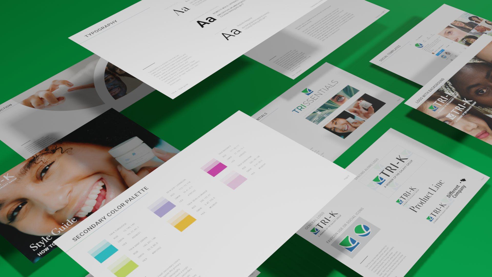
A remixed brand
TRI·K kept its logo and its blue and green. We used the shape of the logo to inspire a new look for brochures, presentations and social media, with secondary colors to keep it fresh.
2
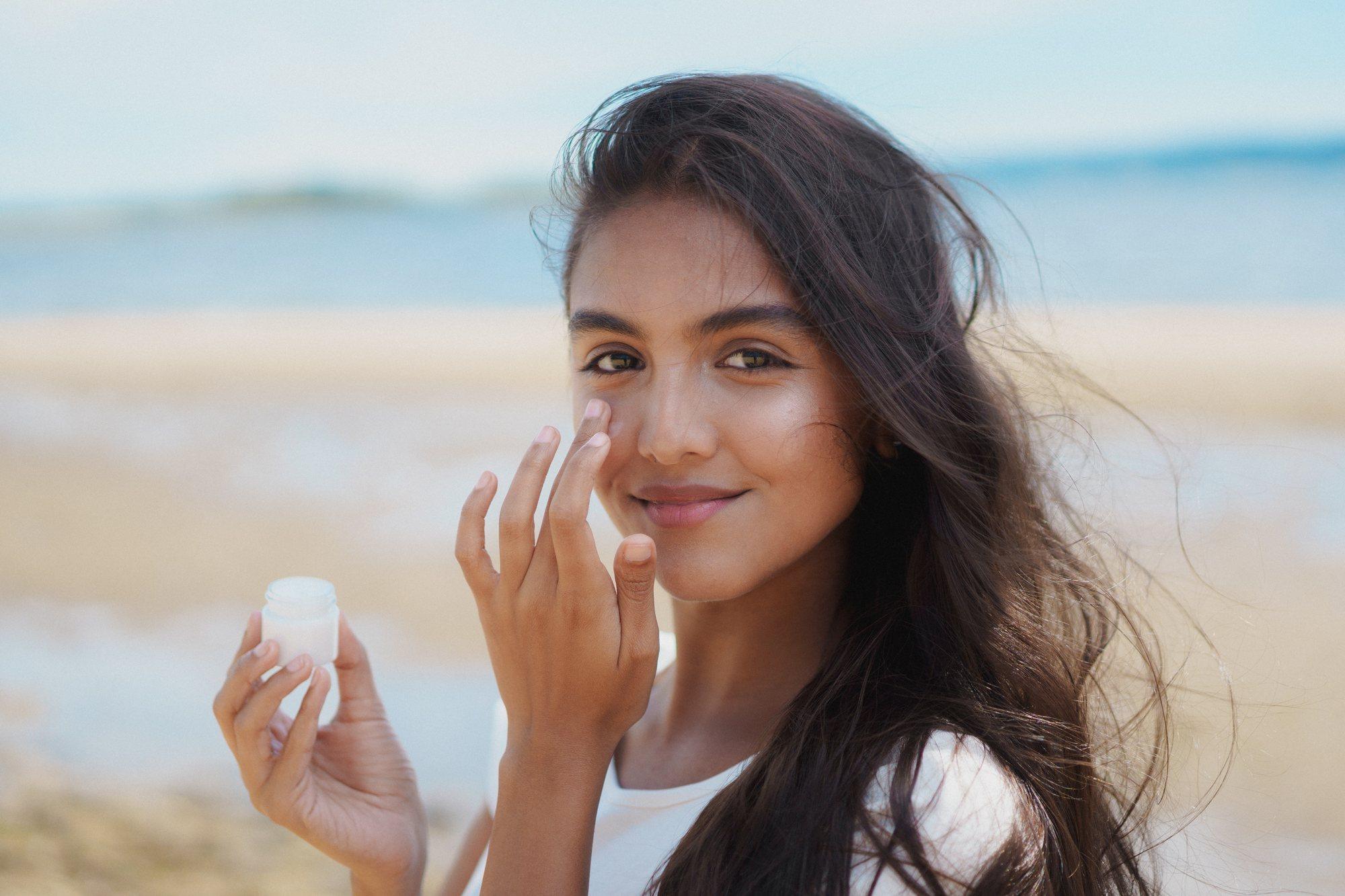
Photos and video on the team’s timeline
We arranged photo and video shoots over 18 months, building a library of visual assets on a timeline that suited the team’s bandwidth and budget.



3
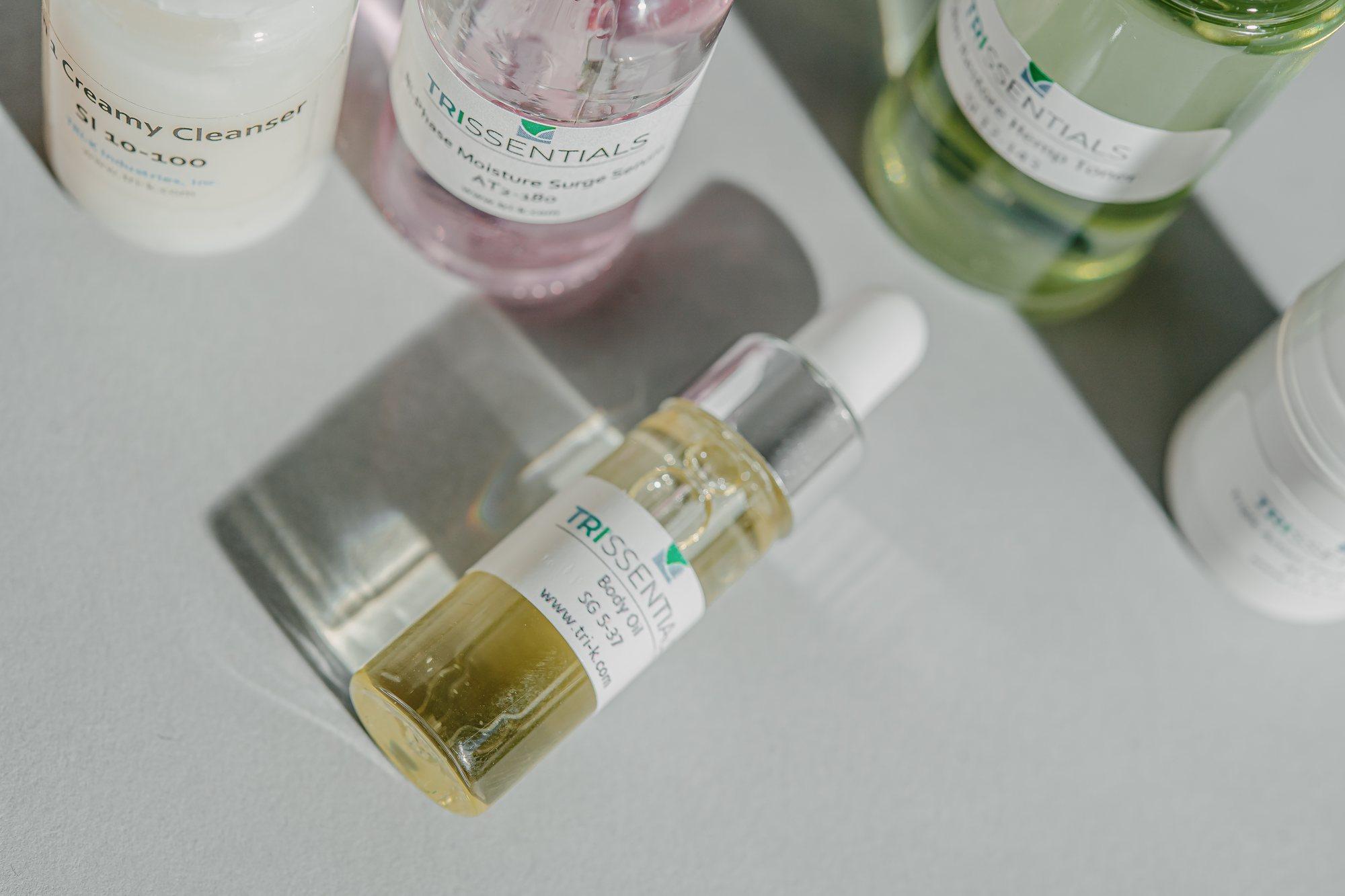
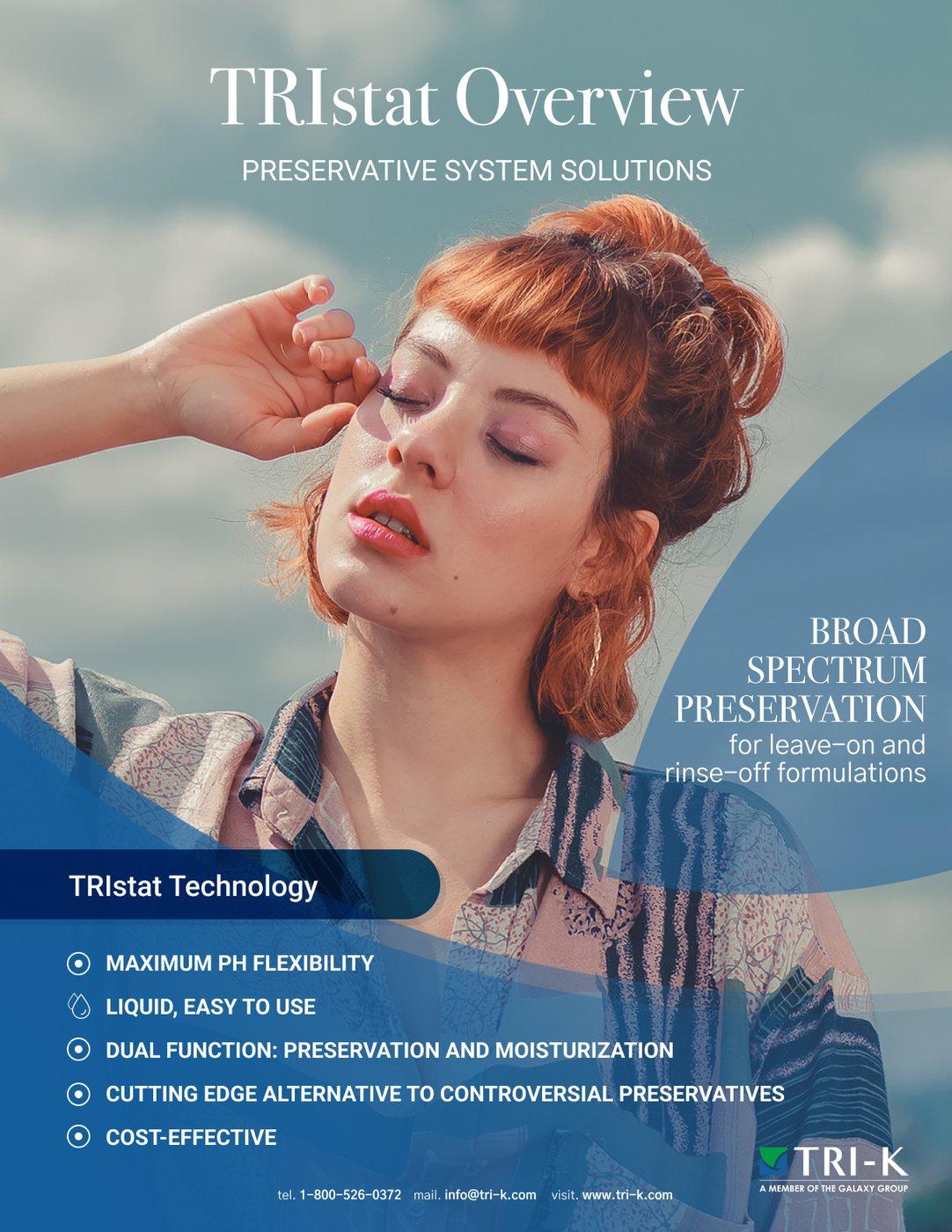
Elevated, yet approachable
An aesthetic for TRI·K’s market: indie beauty brands and the established players keeping up with them. It carries through sell sheets, product photography and social media.
Contact
Let’s talk about your next launch
Jackie Guscott MacAllen · Communications strategist